Critique by Catherine Stock
This critique is done by
Catherine Stock
http://www.CatherineStock.com
 Roxanne Weber writes:
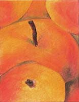
Thank you for the opportunity to have a piece of mine critiqued. This piece is a small original on 3 1/2" by 2 1/2" strathmore 140# cold press. I've been creating many of these little pieces over the past year, but this is so far my best piece (or at least I think it is). A friend of mine named it (innocence) as a result of his belief that there were subliminal elements at work when I created this, on a day when my oldest daughter was in labor with my first grand baby. I'm a fairly new artist, and especially new to watercolor, but it has become my passion! I'm planning to take courses locally in the next few months (I live in San Francisco currently) and some day hope to be able to share my work with the world.
Hello Roxanne
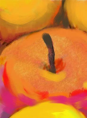
Avoid "kissing shapes" like the two apples touching each other on the upper right of the picture. Rather clearly overlap shapes, and to emphasize that one shape is in front of another, show greater tonal contrast between the two. Try closing your eyes slightly to see tones and the shapes they define. On the original picture, only the front apple really works as a three dimensional shape. The two apples in the background disappear almost completely as shapes. I have illustrated my suggestions using Corell Painter, in an attachment.
Best,
Catherine
http://www.CatherineStock.com
Everything on this site is copyrighted,
Nothing may be copied or reproduced anywhere without written permission!